





Retail Design In California: A Personal Edit At Leisure
27 July 2026
Singapore
Share

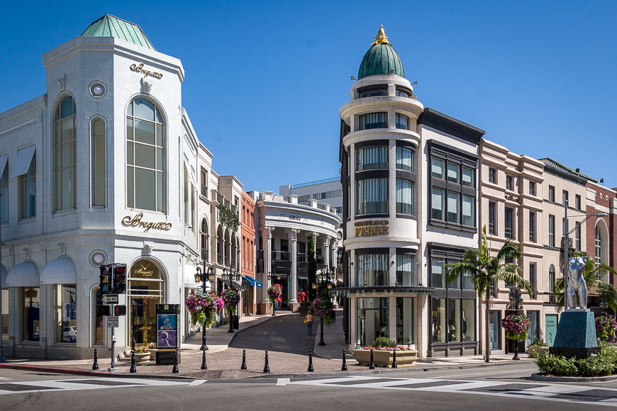
Travel has a way of recalibrating how we see space. Away from schedules, meetings, and the urgency of daily routines, the designer’s eye softens. What emerges is not a search for novelty, but a quieter attentiveness — to light, to movement, to how people inhabit places when no one is rushing them.
On my last trip to the US, I found myself observing retail spaces not as projects to be analysed, but as environments to be experienced. Brick and mortar visits became experience rather than destinations. What stayed with me was not spectacle, but restraint — how thoughtfully designed spaces can feel generous, calm, and quietly confident.
Seen through leisure, retail reveals itself differently.
Retail As Experience: Stories In Space
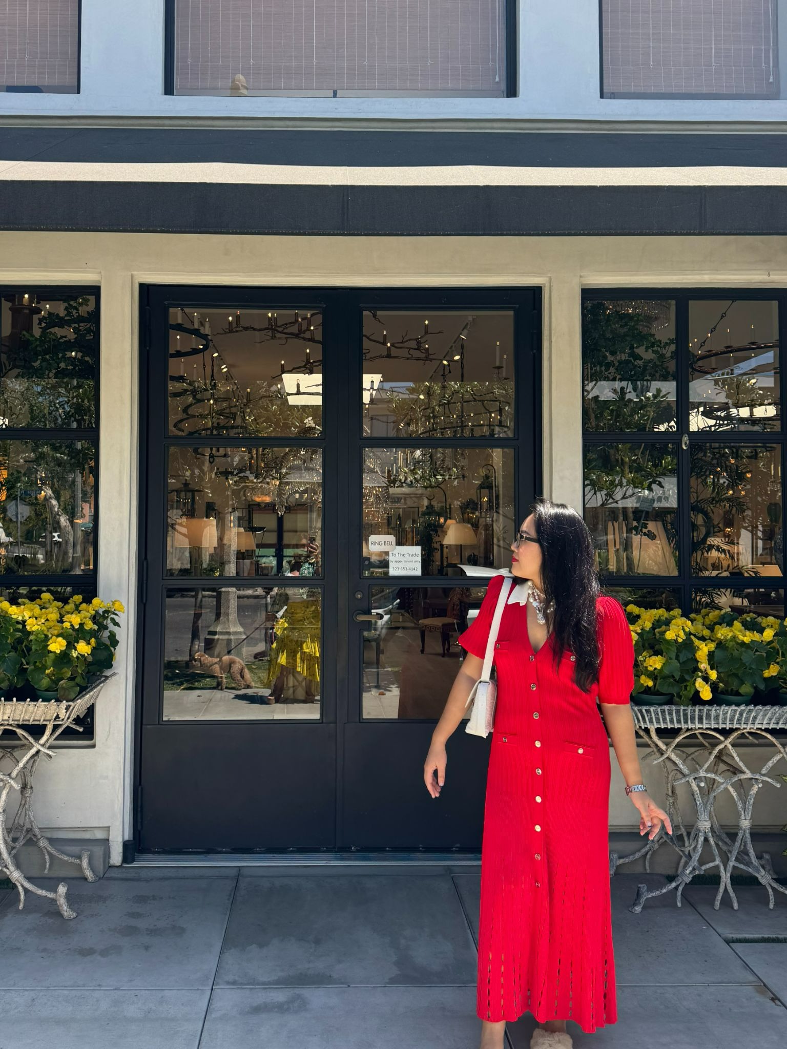
The best retail spaces invite you to slow down. Moving through sunny Los Angeles, I noticed how layout, materiality, and lighting guide movement and shape emotional response — a quiet form of spatial storytelling.
Rather than relying on spectacle, these stores let the brand narrative unfold naturally, rewarding attention with calm, clarity, and intuitive flow.
Key strategies I observed:
- Clear Spatial Sequencing That Reveals The Store Gradually
- Material Consistency That Reinforces Brand Identity
- Controlled Lighting Used To Direct Focus, Not Overwhelm
- Intentional Moments Of Pause That Encourage Unhurried Browsing
This approach transforms retail from a transaction into an experience, where the environment tells the story as much as the products themselves.
For a deeper exploration of how spatial storytelling shapes immersive retail environments, this spread offers further insight.
Farm Rio, Venice — Colour Held With Calm
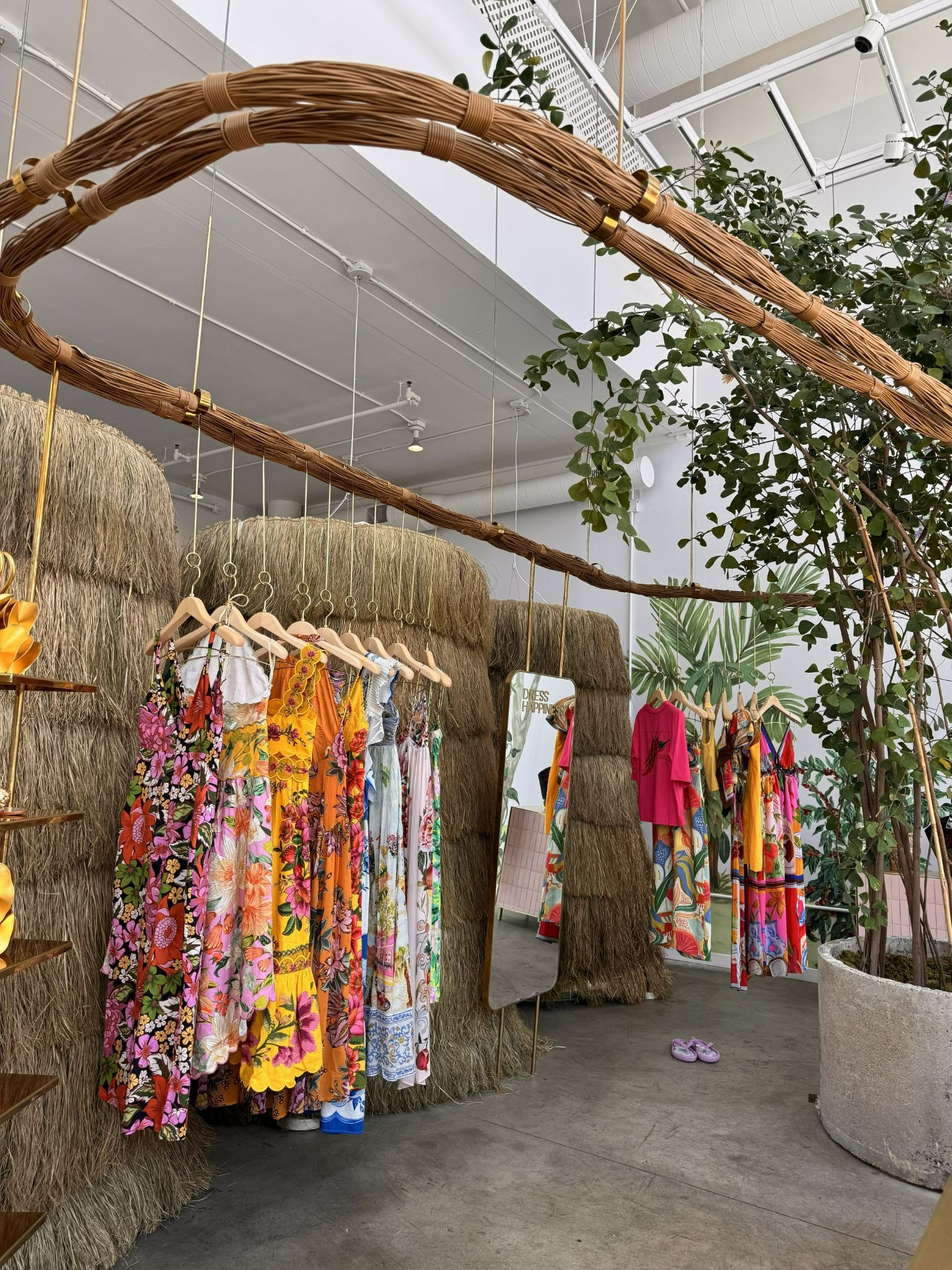
Along Abbot Kinney Boulevard, Farm Rio could easily overwhelm. The brand is known for bold colour and expressive prints, yet the Venice store feels considered rather than loud.
The architecture gently grounds the vibrancy of the collections. Neutral surfaces allow colour to stand confidently without competing for attention, while material choices soften the overall experience. Browsing feels intuitive and unhurried — a rhythm that mirrors the neighbourhood itself.
Interior Details Worth Noticing:
- Sun-Washed Timber And Soft Plaster Finishes
- Generous Spacing That Encourages Browsing Without Urgency
- Colour Anchored By Neutral Architectural Backdrops
- Warm Ambient Lighting That Softens Bold Prints
- An Easy Indoor–Outdoor Rhythm Aligned With Venice’s Street Life
The space blends beautifully with the weather and culture, feeling joyful yet resolved — expressive, but grounded.
Oscar de la Renta, Beverly Hills — Quiet Authority
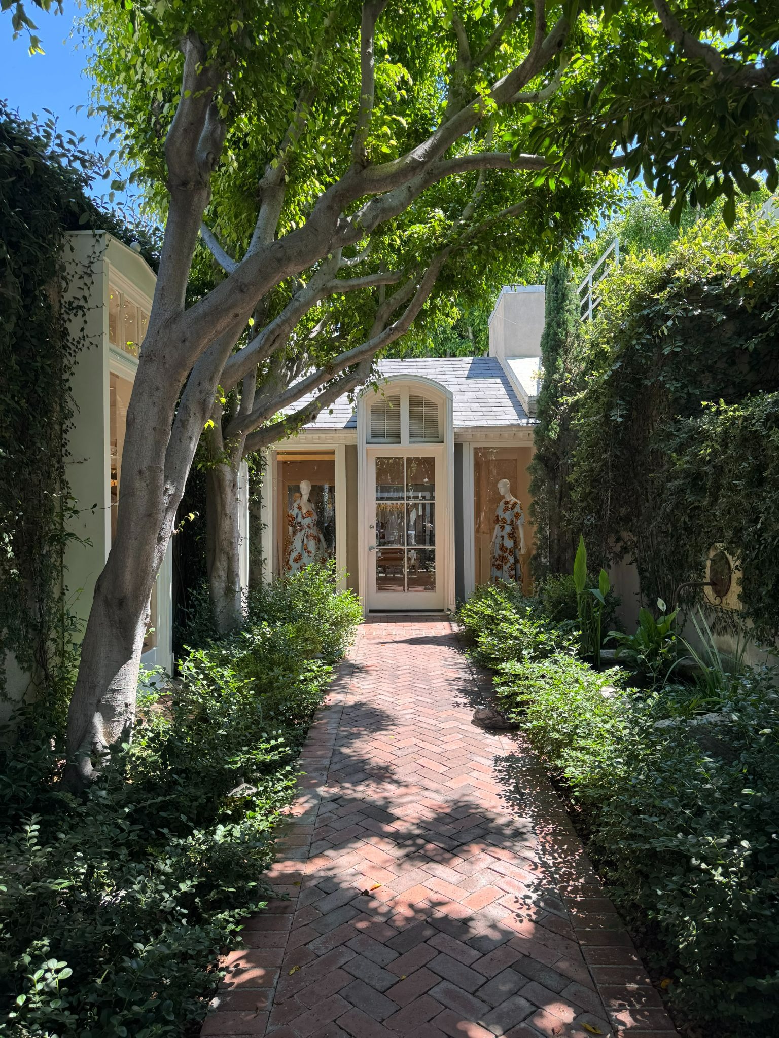
In contrast, the Oscar de la Renta boutique on Wilshire Boulevard communicates confidence through understatement. The space is elegant, composed, and deliberate, without ever feeling austere.
Set within a restored 1950s bungalow, the material palette is restrained and enduring, complemented by layered lighting instead of theatrical gestures. The experience carries a subtle sense of ceremony, warm and inviting, allowing the brand’s legacy to take centre stage.
Interior Details Worth Noticing:
- Refined Stone And Polished Surfaces Used With Restraint
- Layered Lighting That Creates Depth Without Theatre
- Symmetry And Proportion That Signal Heritage And Authority
- Muted Tones That Let Texture Carry Visual Interest
- A Calm Spatial Rhythm That Slows Movement Through The Store
This is retail design rooted in longevity — confident enough not to compete for attention.
Zimmermann, West Hollywood — Femininity And Flow
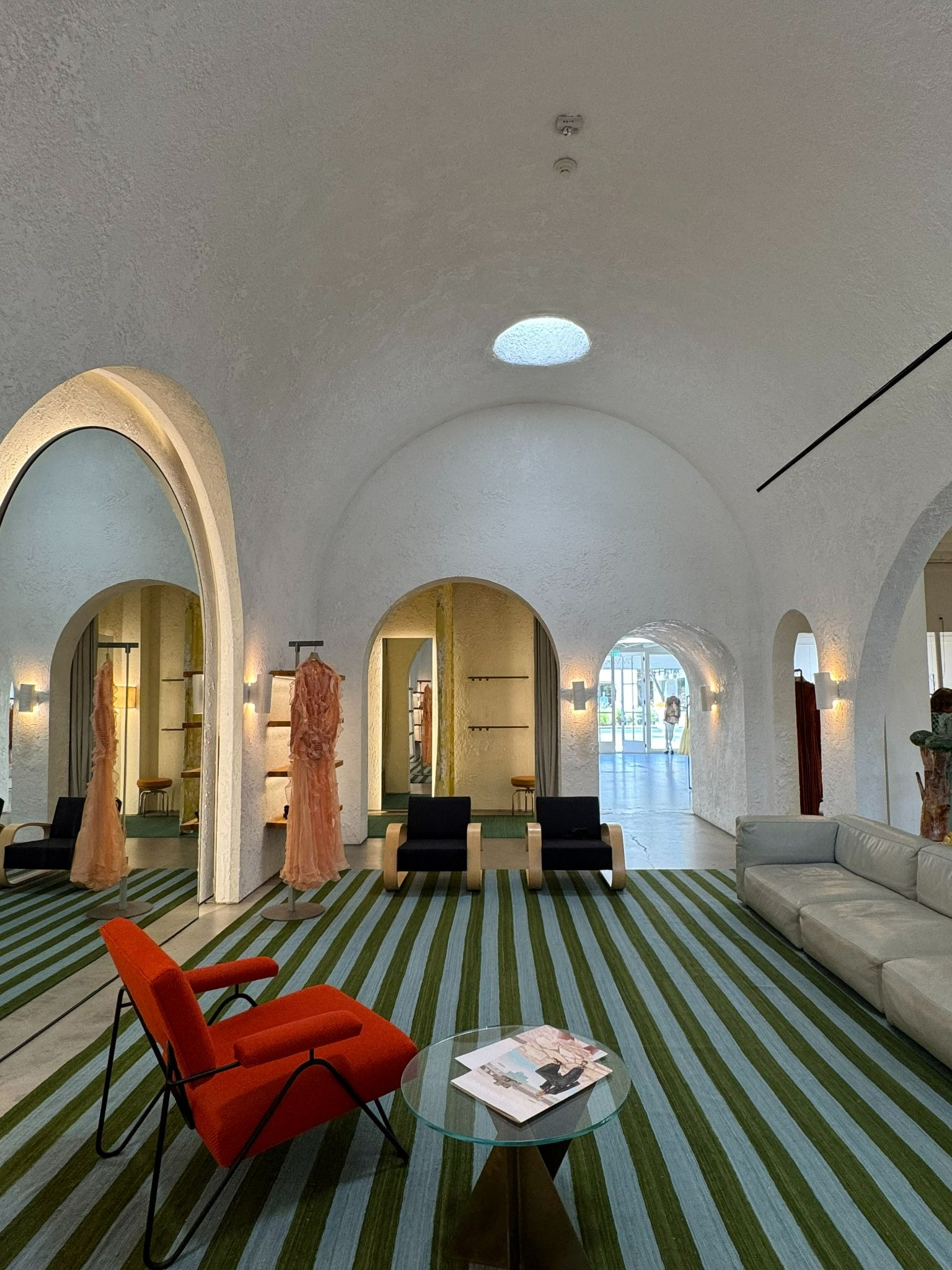
Zimmermann’s Melrose Place boutique sits comfortably between expressiveness and restraint. The space feels light, fluid, and feminine, reflecting the brand’s identity without excess.
Curves soften the architecture, textures add warmth, and the palette works harmoniously with natural daylight. Movement through the store feels intuitive, almost domestic — more like entering a thoughtfully composed home than a commercial space.
Interior Details Worth Noticing:
- Soft Curves And Feminine Lines That Encourage Flow
- Layered Textures That Add Warmth Without Visual Clutter
- A Gentle, Light-Reflective Palette That Enhances Daylight
- Clear Sightlines And Easy Circulation
- Decorative Elements Used Sparingly, Never Competing With Product
The result is relaxed yet refined — a balance that feels increasingly rare.
Timeless Design Lessons to Bring Home
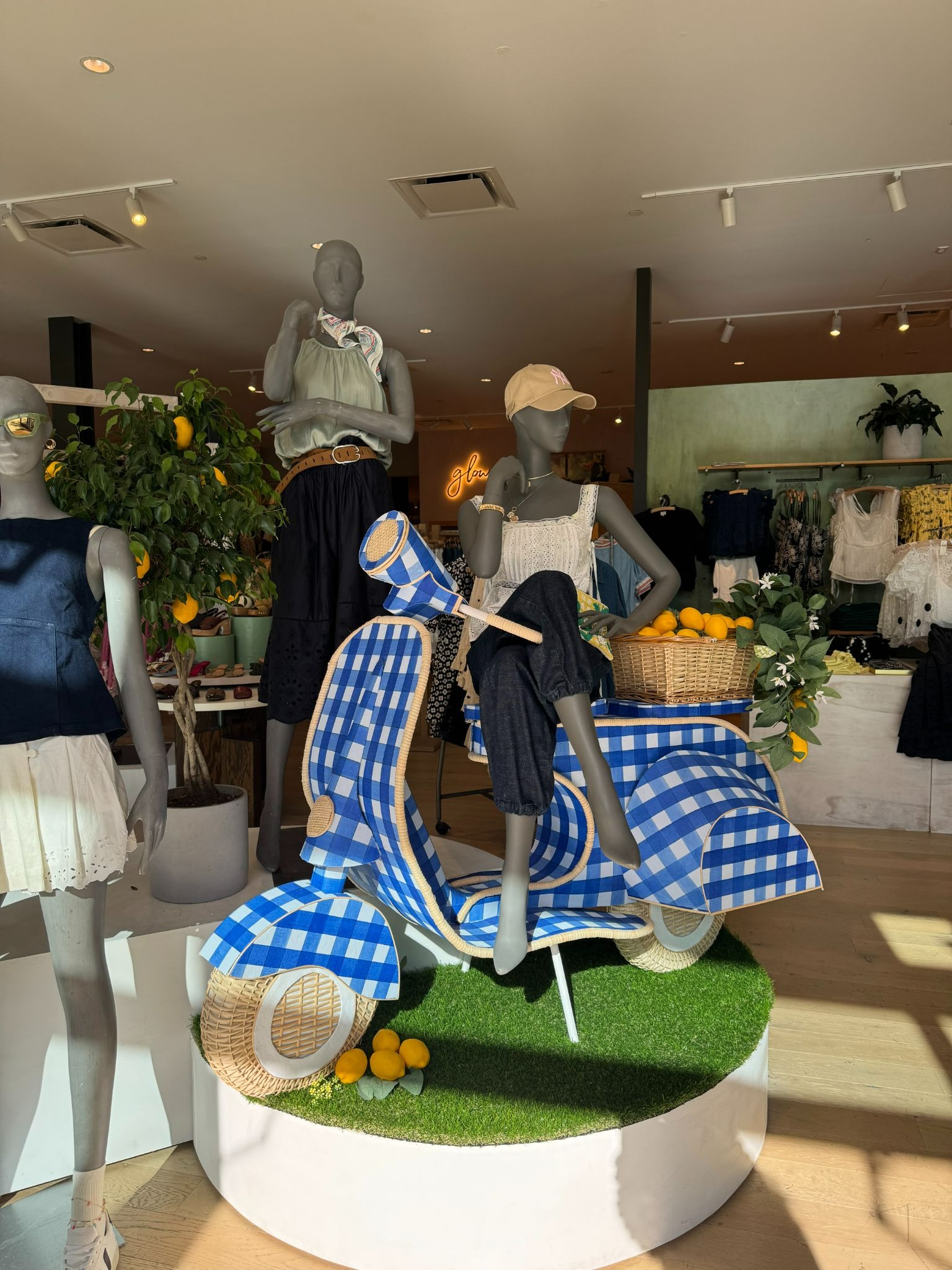
These spaces reinforced principles that resonate deeply with how we approach design at Loren Ng Designs:
- Space Should Support Ease, Not Urgency
- Materials Should Invite Touch, Not Intimidation
- Light Should Soften Experience, Not Perform
- Layouts Should Guide Intuitively, Not Dictate Behaviour
Whether designing homes, retail environments, or workplaces, these ideas remain constant.
When design steps back, life steps forward.
Closing Reflections on Thoughtful Retail Design
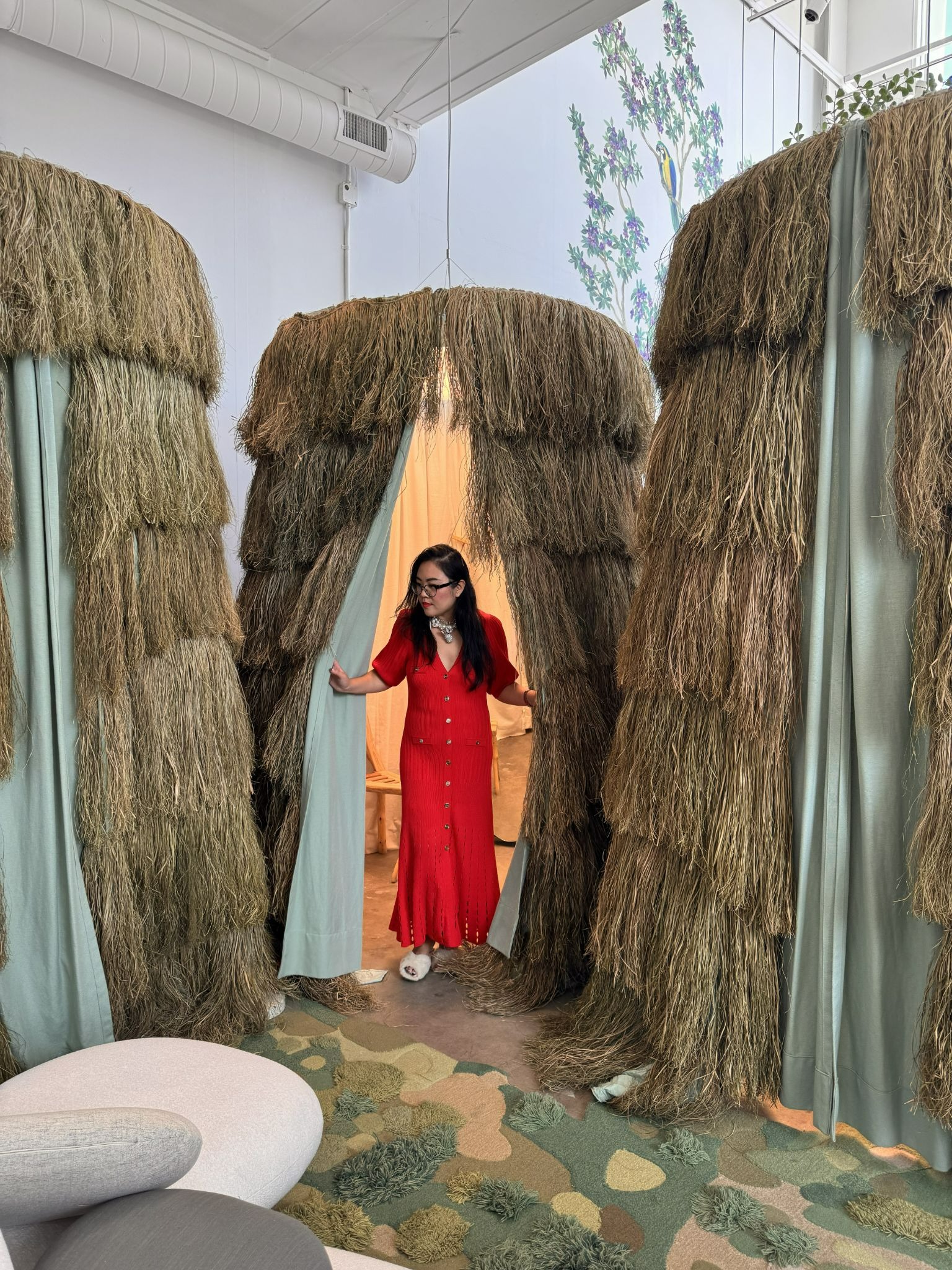
Seen at leisure, retail design becomes less about branding and more about human connection. The most memorable spaces are those that feel calm, intuitive, and quietly generous.
Perhaps that is the greatest lesson travel offers: when we design with restraint and empathy, spaces begin to feel effortless. And it is that effortlessness — carefully considered, never accidental — that endures.
Create Spaces That Speak
Design is more than aesthetics — it shapes how we feel, move, and connect.
At Loren Ng Designs, we create interiors that balance beauty, function, and daily life, informed by travel, observation, and thoughtful restraint.
Discover how a home can feel intuitive, calm, and genuinely lived-in.
📩 ask@lorenngdesigns.com
📷 @loren_ng_designs
Posted by:


BACK TO BLOG
You Might Also Like
.png)
.jpeg)


